Video Tok
A digital platform for assessing developer skills and remote interviewing solution. The platform has features like Video Conferencing, solutions for 35+ Coding Languages, Runtime Code Compilation, Whiteboard, Chat, Complete Screen Recording and onscreen Feedback Form.
I was part of the ambitious project to design the complete user experience.
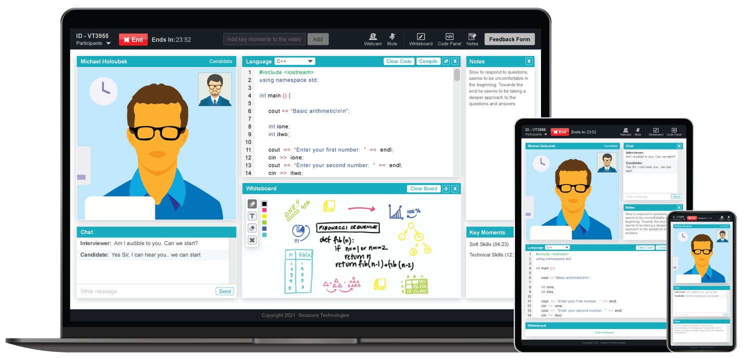
- Role: UI/UX, Visual Designer
- Timeline: 2 Months
- Tools: Figma, Photoshop, Illustrator, Dreamweaver
Overview
There are a number of online interviewing tool available in the marketplace, but a lot of functionalities are missing or or not available under one roof. Hiring teams are facing a lot of difficulties mostly with technical hiring. To address this problem, VideoTok was designed. To differentiate ourselves in an already mature and competitive market, we needed to define a desirable role for the app and how it would meet the needs of the scheme's users. We were thrilled by the opportunity to create something more meaningful.
It features the following key functionalities:
- A seamless browser based pin secured video interviewing solution
- A coding panel which supports 35+ programming languages with runtime code compilation
- An interactive whiteboard for both technical and non technical interviews
- Job based feedback form which loads on the interview screen to rate the candidate during the interview process
- Adding key moments during the interview which helps the hiring manager to review the key moments and take decision faster
- The recorded interview sessions are stored in cloud and can be shared with other stakeholders
My Role
VideoTok is a video interviewing web app that I developed, from conception to execution, for the Talent Acquisition Product HireGate. The goal of the project was to design responsive screens that would function well and look beautiful at all breakpoints and devices.
Competitive Analysis
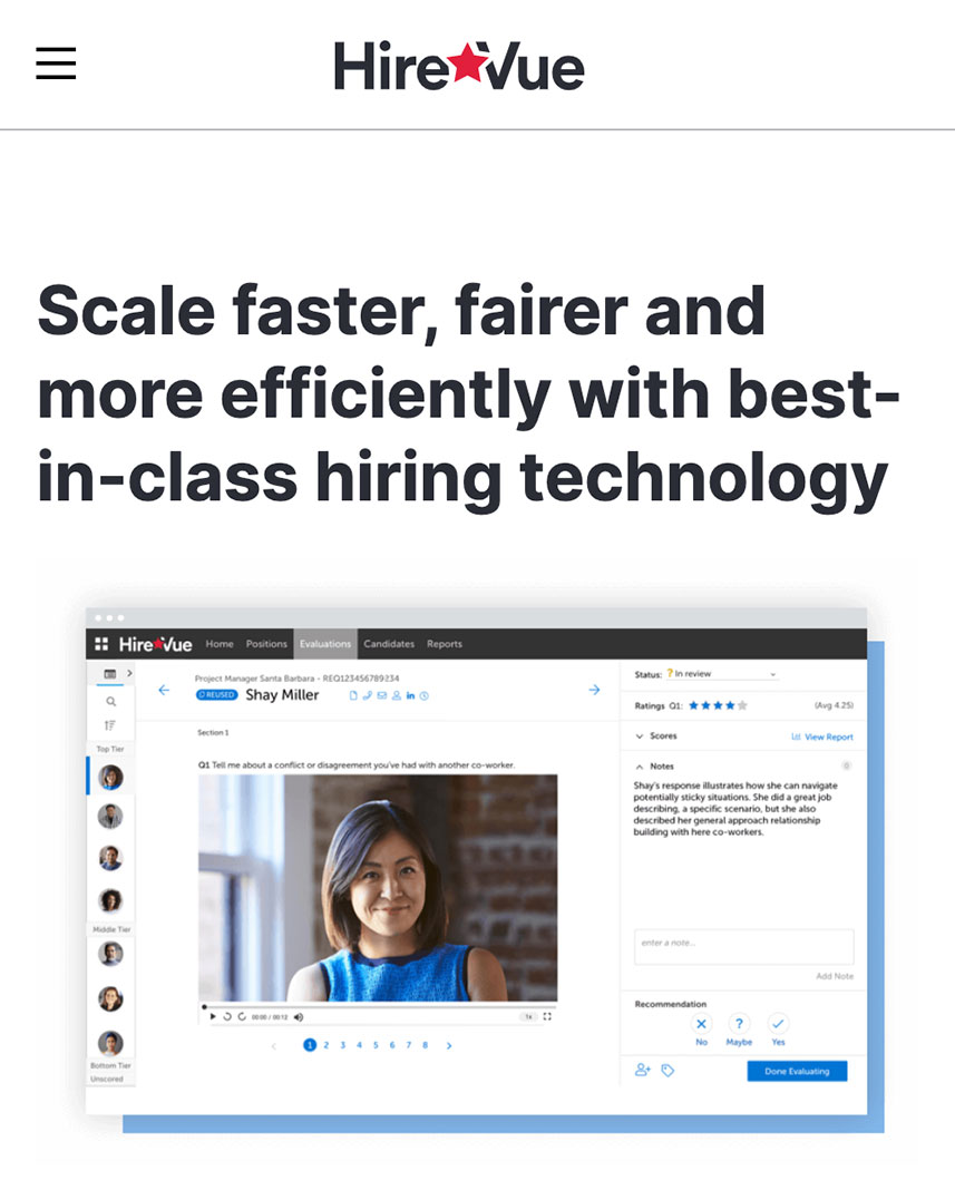
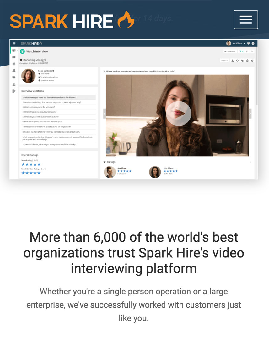
The first step in my design process was to research similar video assessment app currently in the market. This will allow me to identify their strengths and opportunities for my own app. I did an analysis of two competitors: Hire Vue and Spark Hire.
-
-
-
Hire Vue - Swot AnalysisStrengths:
- Many services offered, both for free and for a fee
- Noticeable and easy to understand system
Weaknesses:- Coding panel was not part of Video Interview, so coding skills cannot be evaluated
- Adding key moments was not possible
Opportunities:- Design an app that has all the features under one roof
- Better marketing strategy to increase SEO on Google search
Threats:
-
-
-
-
Spark Hire - Swot AnalysisStrengths:
- Wide target audience / target market
- No 1 app that shows up on google search
Weaknesses:- Users have to register to use the system
- Candidate background verification is not done
Opportunities:- A system where the interviewer or candidate do not have to register or install an app to take the interview
- A system where candidate identity is checked in the background so that impersonation is not possible
Threats:
-
Minimum Viable Product (MVP)
-
MVP Objective:To build an ecosystem and bridge the gap between corporates and jobseekers, where jobseekers can attend interviews from any locationMVP Needs:
- 1: User has to validate to use the app so that the media server can connect the interviewer with the respective candidate
- Token based authentication system
- 2: When using the app, microphone, speaker, camera and internet speed is good for live session
- System Health Check prior to starting the session
- 3: When using the app, the interviewer should be able to test the candidates coding skills
- Coding Panel with runtime code compilation
- 4: The interviewer should be able to rate the candidate based on job requirement during the interview process
- Feedback form with comments and rating
-
Next, I gathered requirements to define what features are required to design the app. I developed key user stories (from my personas) and minimum viable products (MPVs)The MPVs would allow me to quickly test my initial design on users, giving me valuable feedback early in the design process and to address any concerns right from the beginning.
User Flow Diagram

Wireframe / Low Fidelity Mockup
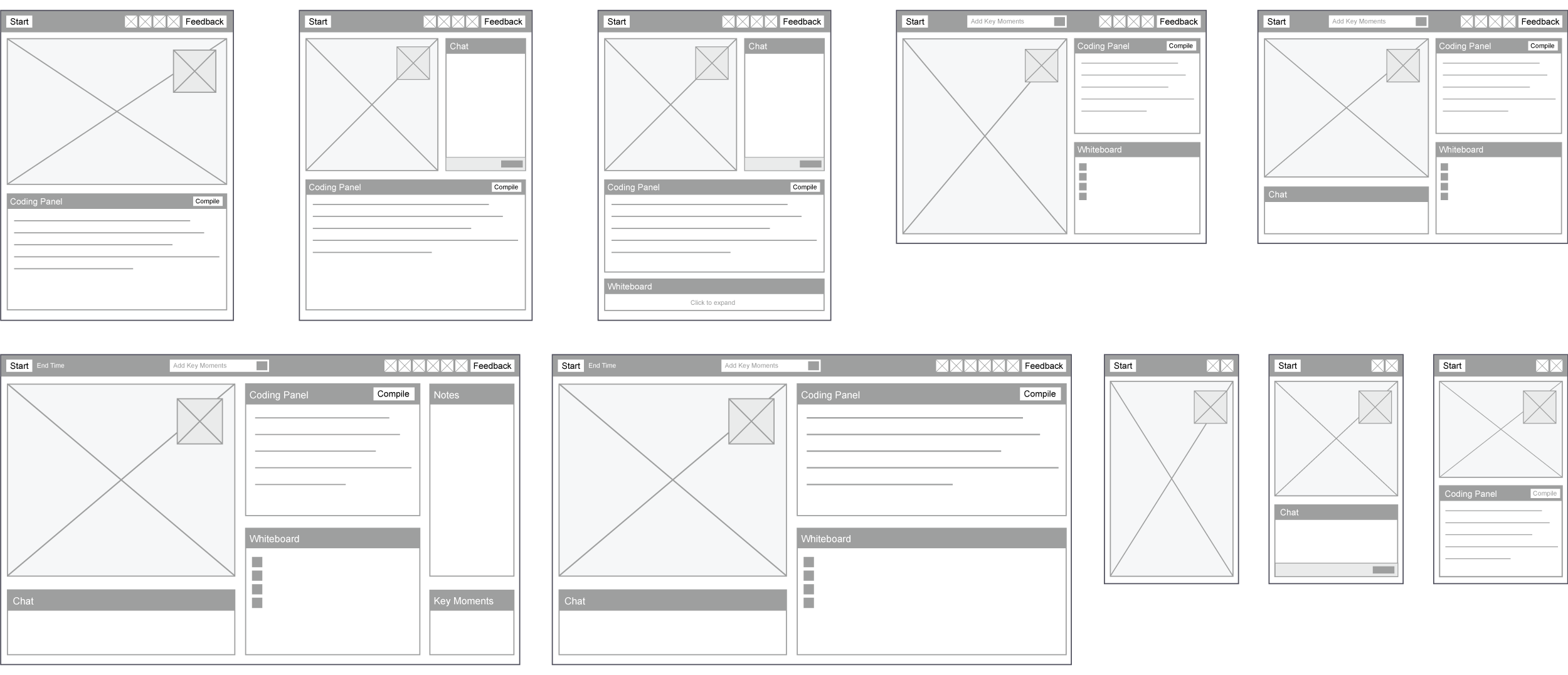
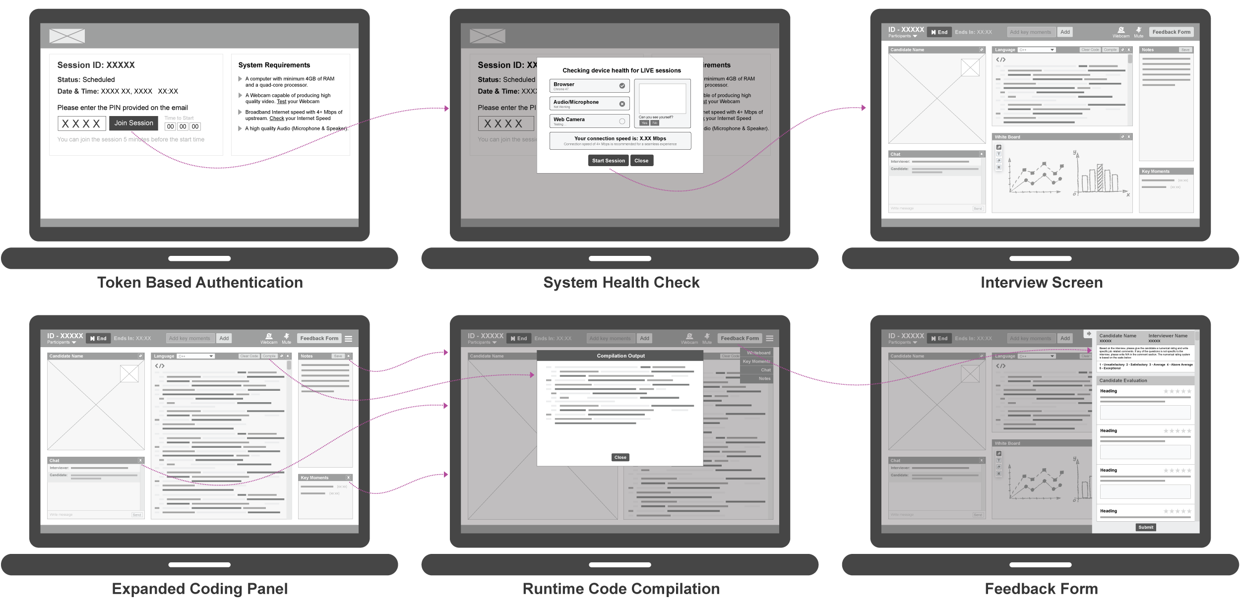
Using my user personas, user flows and MPVs as a guide, I sketched out the wireframes. After multiple sessions, I picked the designs that I felt addressed the MPV goal the best, and converted them to prototype in inVision.
Clickable Prototype
User Testing
Using my prototypes, I engaged interviewers and candidates to conduct remote moderated usability testing on my designs. During the test, I asked them to complete a series of tasks that helped me to understand their thought process and see if they could accomplish the MVP goals. This was also the perfect time to ask about their likes and dislikes of the prototype.
-
Tasks for Interviewers -
- Authenticate by using the PIN provided
- Have to check if the device is good for live video session
- You have to add key moments to the video so that the interview can be reviewed easily
- Have to select a language to evaluate the candidate and compile the candidates code runtime
- Predefined set of questions are provided to review the candidate. You have to rate and comment on the candidate during the interview process.
-
Tasks for Candidates -
- Authenticate by using the PIN provided
- Have to check if the device is good for live video session
- Have to write code based on the question asked
- Have to use the whiteboard to explain a solution
- Find the functional buttons and check if it can be easily understood and used
- Write notes during the session and save it local drive for future reference
After the user interviews, I synthesized and ranked my observations into concrete issues. This helped me prioritize and understand the most important pain points and propose new solutions for my design and ideas for my next iteration based on the results.
Iconography
-
I have used the 8px grid system for the iconography. I have sized the icons proportionally, with the height as a multiple of 8. I used 16px, 24px, 32px and 48px.Icons should have a clean and simple 2D design.Any clickable icon should be in secondary color, there must be a good contrast against the background color.
-